Crystal’s Creations
A gradient identity for Crystal's Creations, a beauty and hair artistry brand. A woman's profile emerges in negative space from a blue-to-magenta crescent, a butterfly resting in her upswept hair — transformation as the brand's promise.
Logo System
A crescent 'C' washed in a blue-to-magenta gradient reveals a woman's profile in negative space, with a detailed butterfly perched in her upswept hair — building the initial, the client, and the idea of transformation into one mark.
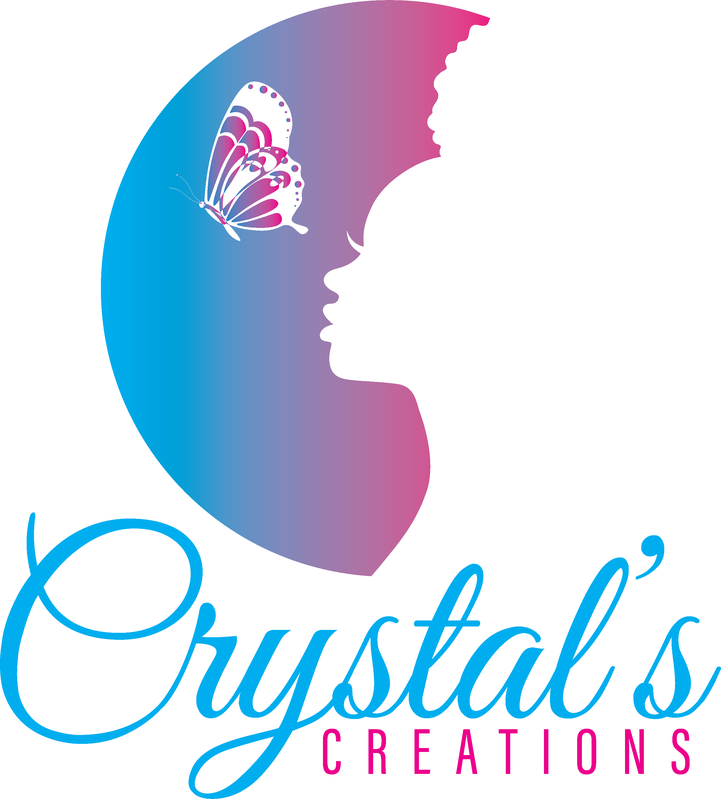 PRIMARY · LIGHT SURFACES
 REVERSED · DARK SURFACESKNOCKOUT · BRAND FIELD
Clearspace & Minimum Size
Clearspace equals the height of the “C” on all sides. Minimum size: 120 px on screen · 30 mm in print.
120 PX / 30 MM MIN
Color System
Values for screen (HEX / RGB) and print (CMYK).
RGB 0 · 174 · 239
CMYK 100 27 0 6
RGB 236 · 0 · 140
CMYK 0 100 41 7
RGB 160 · 122 · 172
CMYK 7 29 0 33
RGB 223 · 245 · 253
CMYK 12 3 0 1
Typography
The pairing that extends the wordmark’s voice into headlines and body copy.
Great Vibes mirrors the flowing, high-contrast script of the 'Crystal's' wordmark with the same graceful loops and feminine energy.
Montserrat's clean geometric caps echo the letterspaced 'CREATIONS' line and keep supporting copy modern and legible.
Usage Standards
Always
- Keep the gradient flowing blue (left) to magenta (right)
- Pair script 'Crystal's' with letterspaced caps 'CREATIONS'
- Place the color mark on white or very light backgrounds
- Use the mark large enough to keep the butterfly's wing detail legible
Never
- Reverse or recolor the blue-to-magenta gradient
- Separate the butterfly from the profile as a standalone mark
- Add outlines or drop shadows to the script lettering
- Set the color version over busy photos or dark fields — use the knockout instead