Unified Paradigms
A joyful, people-first identity for Unified Paradigms (U.P.), a nonprofit organization built around unity across differences — two hands of different skin tones meeting in a celebratory high-five beneath a radiant burst.
Logo System
Two illustrated hands of different skin tones rise into a high-five beneath concentric yellow arcs and confetti sparks, pairing a flowing two-color script wordmark with the (U.P.) initials.
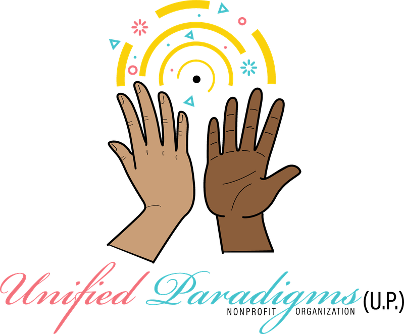 PRIMARY · LIGHT SURFACES
 REVERSED · DARK SURFACESKNOCKOUT · BRAND FIELD
Clearspace & Minimum Size
Clearspace equals the height of the “U” on all sides. Minimum size: 120 px on screen · 30 mm in print.
120 PX / 30 MM MIN
Color System
Values for screen (HEX / RGB) and print (CMYK).
RGB 250 · 209 · 11
CMYK 0 16 96 2
RGB 70 · 194 · 203
CMYK 66 4 0 20
RGB 242 · 114 · 124
CMYK 0 53 49 5
RGB 201 · 158 · 119
CMYK 0 21 41 21
RGB 139 · 94 · 59
CMYK 0 32 58 45
Typography
The pairing that extends the wordmark’s voice into headlines and body copy.
Great Vibes mirrors the wordmark's flowing formal script, keeping the headline warm, human, and celebratory.
Nunito's rounded, friendly sans keeps supporting copy approachable and optimistic — the right tone for a community nonprofit.
Usage Standards
Always
- Keep both hands and the arc burst intact — the high-five is the message
- Use the two-color script split (coral 'Unified', teal 'Paradigms') in full-color lockups
- Place the logo on white or very light backgrounds for full-color use
- Give the confetti sparks room — generous clearspace keeps the mark festive, not busy
Never
- Never recolor the hands or flatten both to one skin tone
- Never set the script wordmark in a single color when full color is available
- Never place the full-color mark on busy photos or saturated backgrounds
- Never separate the (U.P.) initials from the wordmark as a standalone logo