Anchor of Hope Haven — Brand Identity
Role — Logo design · identity system · brand guidelines
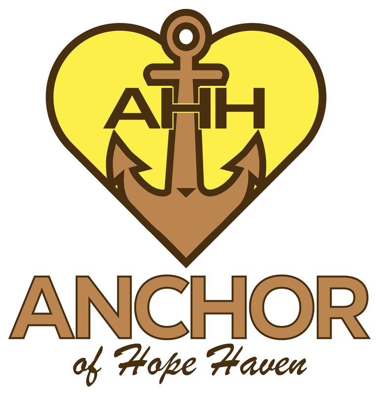
Anchor of Hope Haven needed a mark that communicates steadiness and compassion in the same breath — the kind of emblem a hope-centered care organization can put on a door, a letterhead, or a donor packet and be trusted on sight. Inferring from the artwork, the mark had to carry a three-letter monogram, a full wordmark, and a softer script descriptor while staying legible at small sizes and reproducing cleanly in a tight three-color palette.
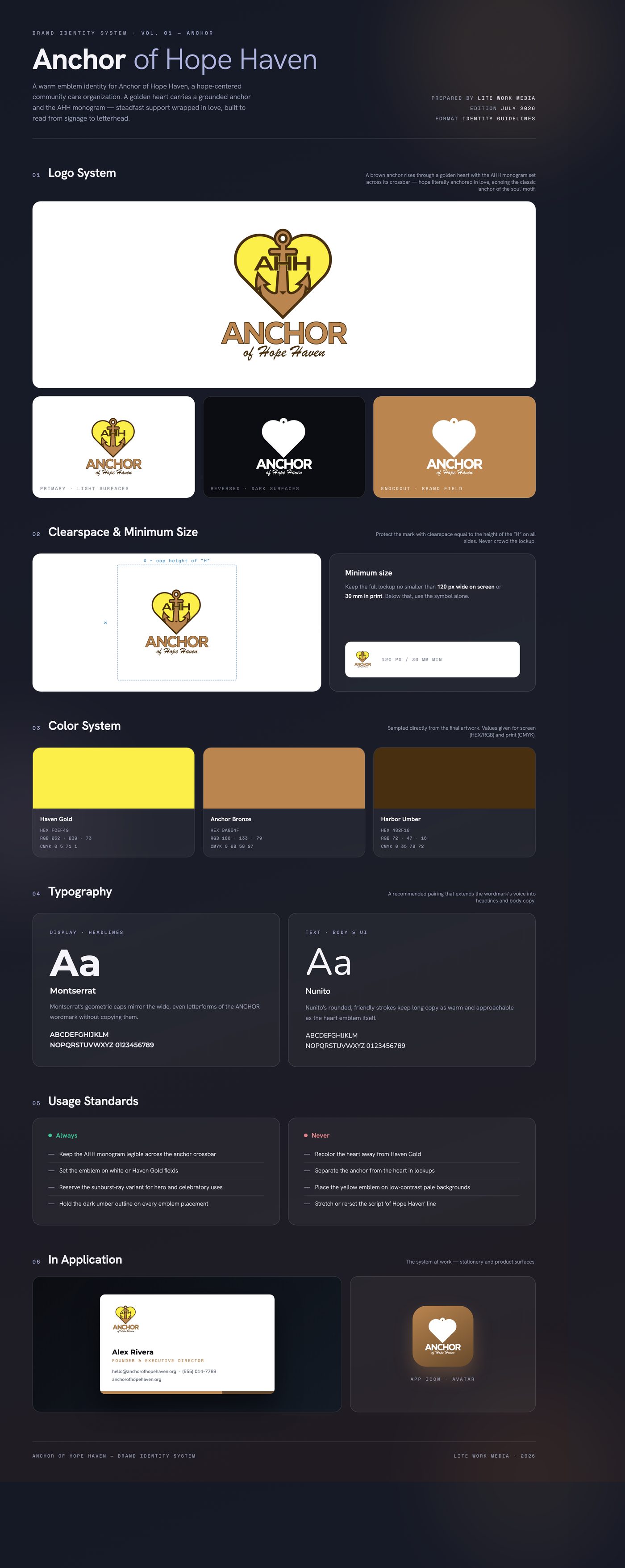
The solution fuses the two ideas in the name into one emblem: a golden heart (the haven) pierced by a grounded bronze anchor (the hope that holds). The AHH monogram sits across the anchor's crossbar in dark umber, so the initials and the symbol read as a single object. A geometric all-caps ANCHOR wordmark anchors the lockup, with 'of Hope Haven' in a casual script to add human warmth; a sunburst-ray variant extends the emblem for hero moments.
Delivered a lockup suite — emblem-only heart-and-anchor mark, full stacked lockup with wordmark and script descriptor, and a radiant sunburst variant — in a consistent three-color gold, bronze, and umber palette, supplied as high-resolution raster artwork ready for print and digital use.
Like what you see?
Start a project