B.U.B.G — Brand Identity
Role — Logo design · identity system · brand guidelines
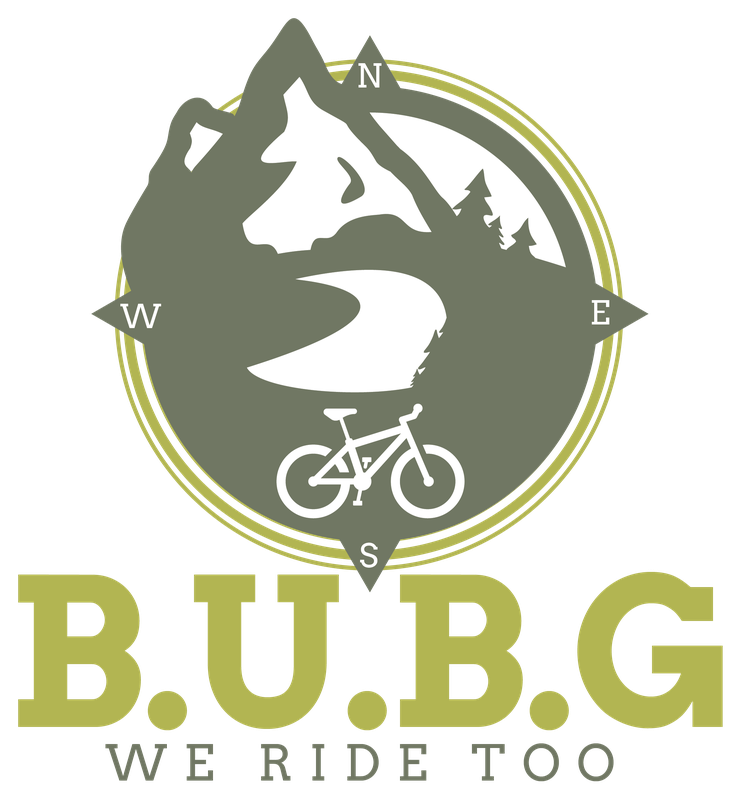
B.U.B.G is a riding group, and its motto — 'We Ride Too' — reads as a statement of belonging on the trail. The mark needed to work like a club patch: instantly legible on a jersey or tee, credible next to established outdoor and MTB brands, and flexible enough to live as a standalone emblem or a full stacked lockup. From the artwork, the clear constraints were apparel-first reproduction and a limited, screen-print-friendly color count.
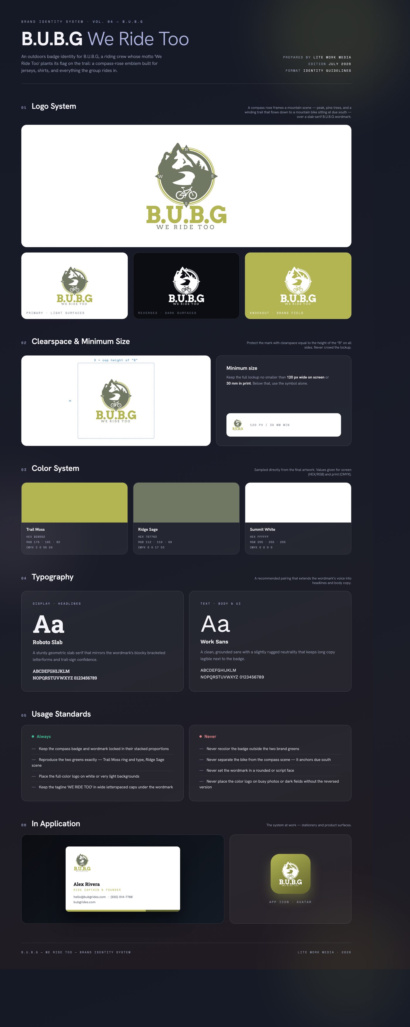
The identity is a compass-rose badge: a mountain peak and pine treeline sit inside the ring, a trail winds down through the scene, and a mountain bike anchors the south point — navigation, terrain, and the ride in one emblem. Two earthy greens carry it: a muted sage for the landscape and a bright trail-moss chartreuse for the compass ring and the slab-serif B.U.B.G wordmark, with 'WE RIDE TOO' letterspaced beneath as the rallying cry.
Delivered the final stacked lockup as production vector art with print-ready PNG and JPG exports, plus apparel mockups — a set of crew-neck t-shirt visualizations showing the badge printed at chest scale on white tees. The two-color build keeps the mark simple to screen print across club apparel and gear.
Like what you see?
Start a project