M.A.K Development — Brand Identity
Role — Logo design · identity system · brand guidelines

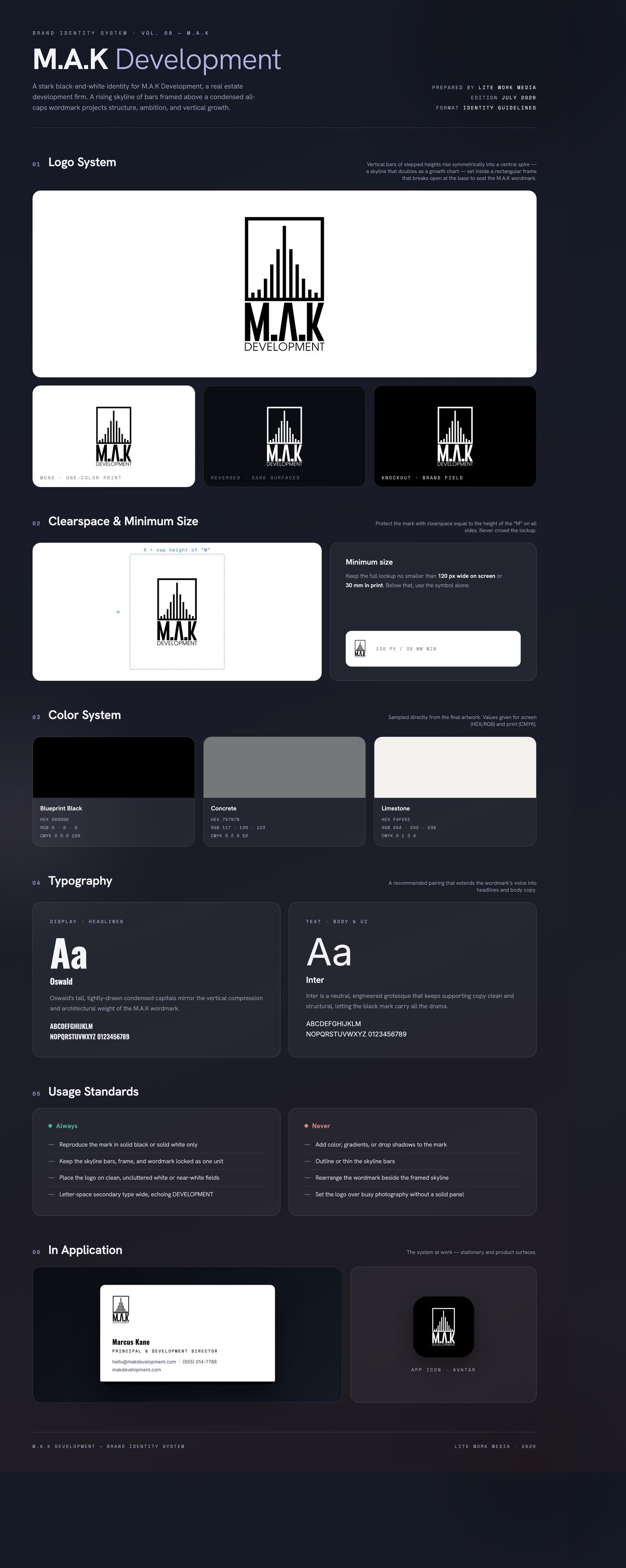
A real estate development company needed a mark that read as established and capable of building at scale — something that would hold up on site signage, proposals, and contracts alongside legacy firms. The initials M.A.K had to anchor the identity, and the mark needed to communicate 'development' at a glance while staying rigorous enough, as inferred from the artwork, to reproduce in one color across print, embroidery, and large-format signage.
The solution turns the skyline itself into the logo: thirteen vertical bars step upward to a central spire, reading simultaneously as a city silhouette under construction and a rising growth chart. A rectangular frame contains the skyline and breaks open at its base, where the condensed M.A.K wordmark — its A stripped to a crossbar-less peak that echoes the spire — carries the structure. Wide-tracked DEVELOPMENT grounds the lockup. Pure black on white keeps it architectural and timeless.
Delivered a locked primary lockup with the framed skyline, M.A.K wordmark, and DEVELOPMENT descriptor, produced as print-ready and screen-ready exports (PNG, JPG, plus native and PDF source files). The one-color black construction reverses cleanly to white, giving the firm a single flexible mark for signage, documents, and digital use.
Like what you see?
Start a project