Mission-Driven Brand Identity & Healthcare Positioning
Role — Creative Director / Designer
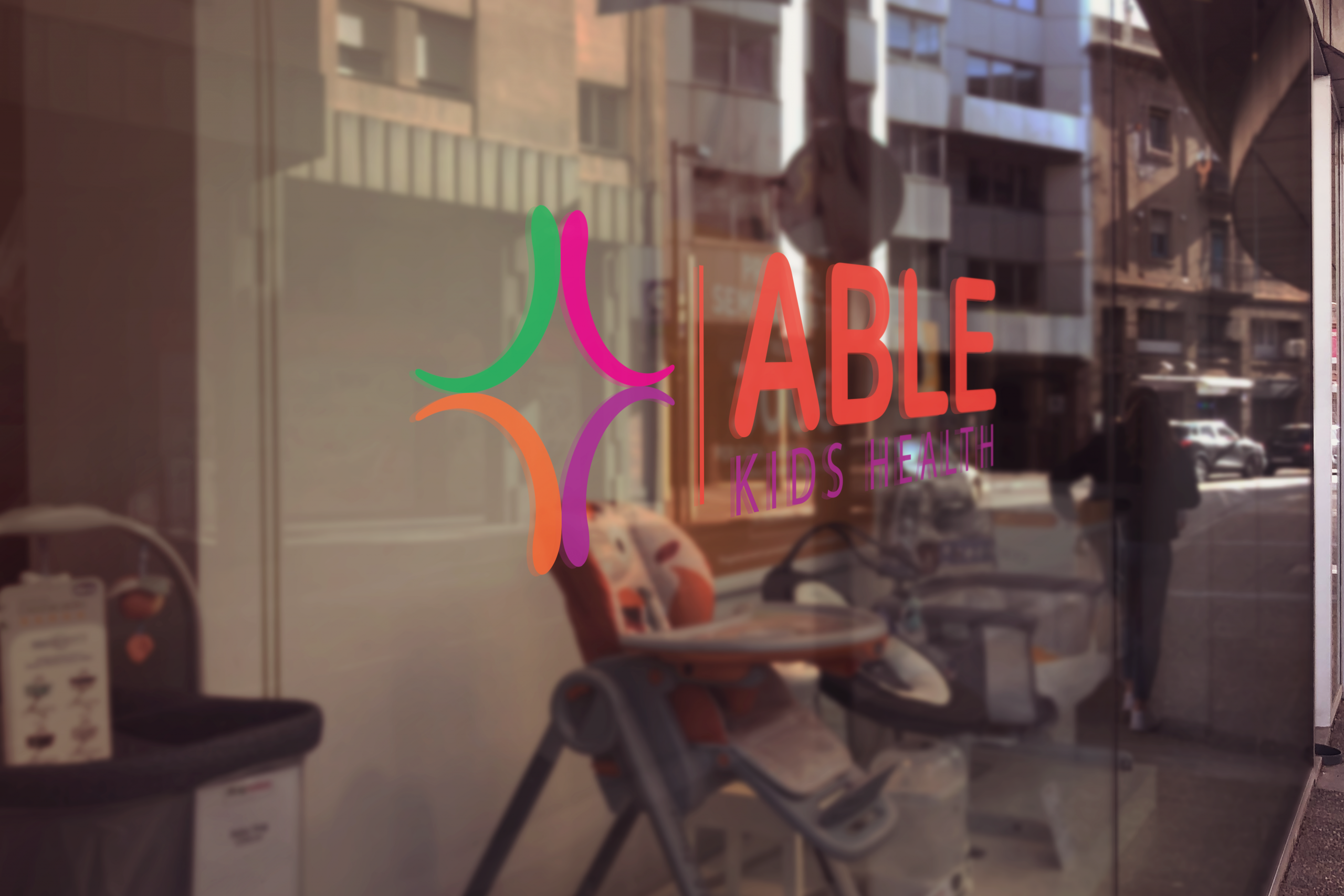
ABLE Kids needed a visual identity that reflected both professionalism and compassion while supporting a rapidly growing organization serving children with autism through therapy and developmental services. The opportunity was to create a logo that communicated trust, optimism, and care — something emotionally resonant for families while remaining scalable as the organization expanded across multiple clinic locations in the Southeast. ABLE Kids was founded to help children with autism “Achieve Beyond Life’s Expectations” and has grown significantly since launch, creating a need for a recognizable and mission-aligned brand presence.
As Creative Director/Designer, I developed the logo identity with a focus on warmth, accessibility, and credibility. The creative approach centered on building a visual mark that balanced the emotional sensitivity of pediatric care with the professionalism expected from a healthcare-focused organization.
Rather than designing a generic healthcare logo, I approached the identity as a brand story — creating a visual system intended to feel hopeful, family-centered, and trustworthy while remaining flexible enough to work across signage, print, digital platforms, uniforms, marketing collateral, and future clinic growth. The goal was to create a mark that families could immediately recognize and emotionally connect with.
The final logo established a recognizable visual foundation for a growing, mission-driven healthcare organization and contributed to stronger brand consistency as ABLE Kids expanded its presence across the Southeast. By aligning visual identity with organizational mission, the brand gained a professional yet compassionate look that supported trust, recognition, and long-term scalability as the company continued to grow.
Like what you see?
Start a project