The Parent App — Brand Identity
Role — Logo design · identity system · brand guidelines
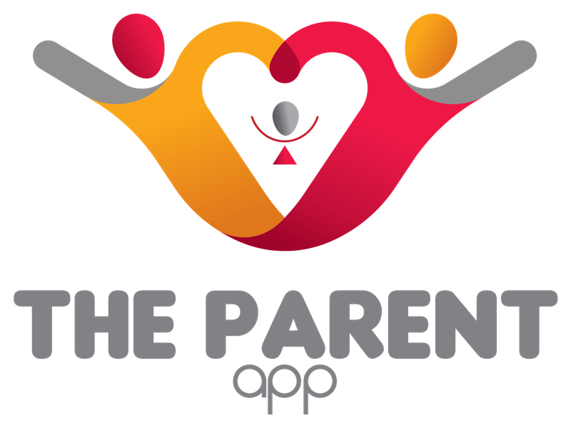
A parenting app needed a mark that communicated family, warmth, and protection at a glance — legible as an app icon yet emotive enough to carry a consumer brand. The identity had to read instantly across contexts, from a small home-screen tile to a wide website header, which called for a flexible lockup system rather than a single fixed logo. The audience is parents, so the mark had to feel joyful and caring, never clinical or corporate.
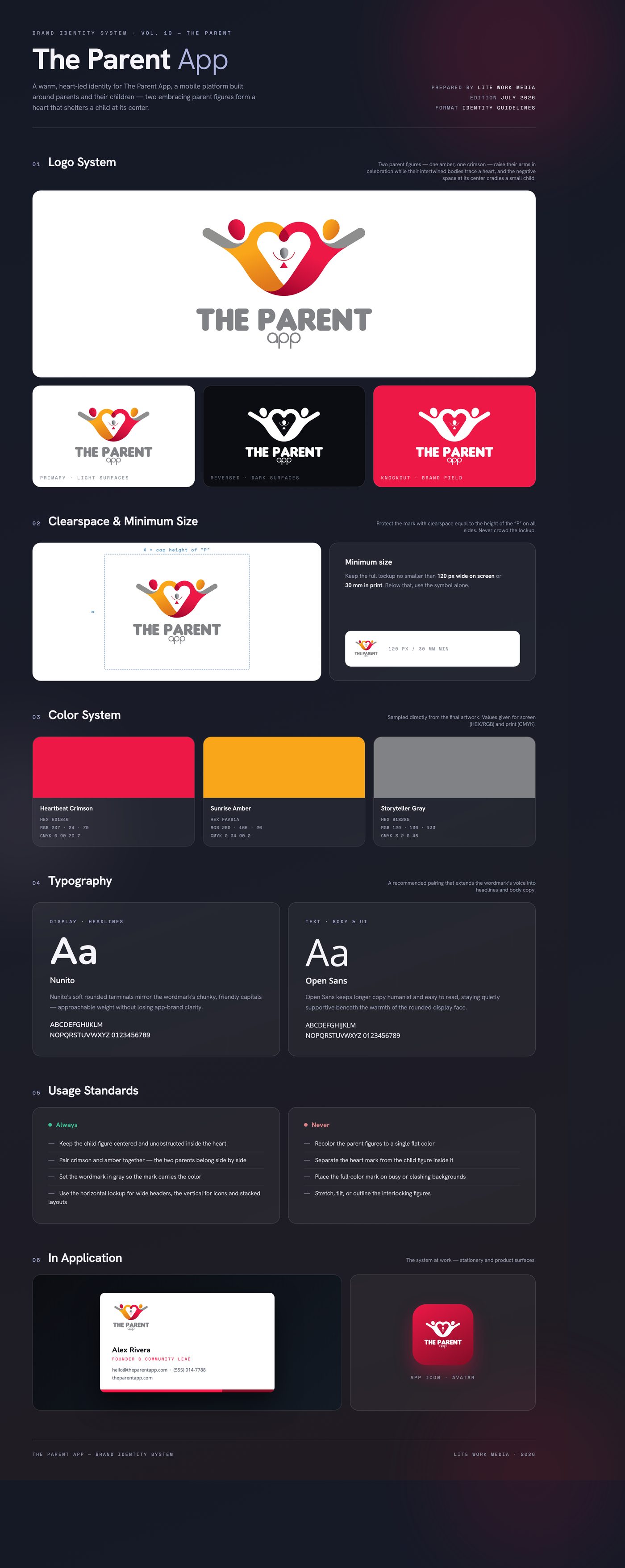
The solution is a pictogram of two parents with arms raised in joy, their bodies interlocking to form a heart; the negative space at the heart's center becomes a small child, sheltered by both figures. Crimson and amber give each parent a distinct, warm identity, while a soft gray rounded wordmark — bold 'THE PARENT' over a lighter lowercase 'app' — keeps the typography friendly and lets the mark carry the color.
Delivered a two-orientation lockup system — a vertical stack for app icons, avatars, and square placements, and a horizontal lockup for headers and wide formats — with full-color artwork exported as production-ready PNGs alongside native and PDF source files, plus usage guidance for the identity.
Like what you see?
Start a project