It’s a Wade Thang — Brand Identity
Role — Logo design · identity system · brand guidelines
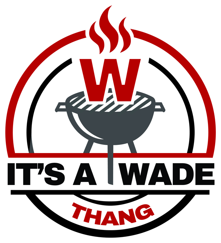
A family-name barbecue brand needed a mark that felt like a backyard cookout, not a corporate restaurant chain. The phrase 'It's a Wade Thang' is an inside joke turned brand name, so the identity had to carry that personality while staying legible as a round badge — the format most likely to end up on aprons, tees, koozies, and smoker decals. It also had to hold up in limited color for low-cost apparel printing.
The solution is a circular pit-badge: a charcoal kettle grill rendered in flat silhouette, with a flame-red W lifting off the grate where the smoke would rise — the family initial literally cooking on the grill. Three red flames crown the mark, and the wordmark breaks through the ring on a horizontal band, with THANG tucked on a curved baseline below. The palette is tight and print-friendly: pit-fire red, kettle charcoal, and black on white.
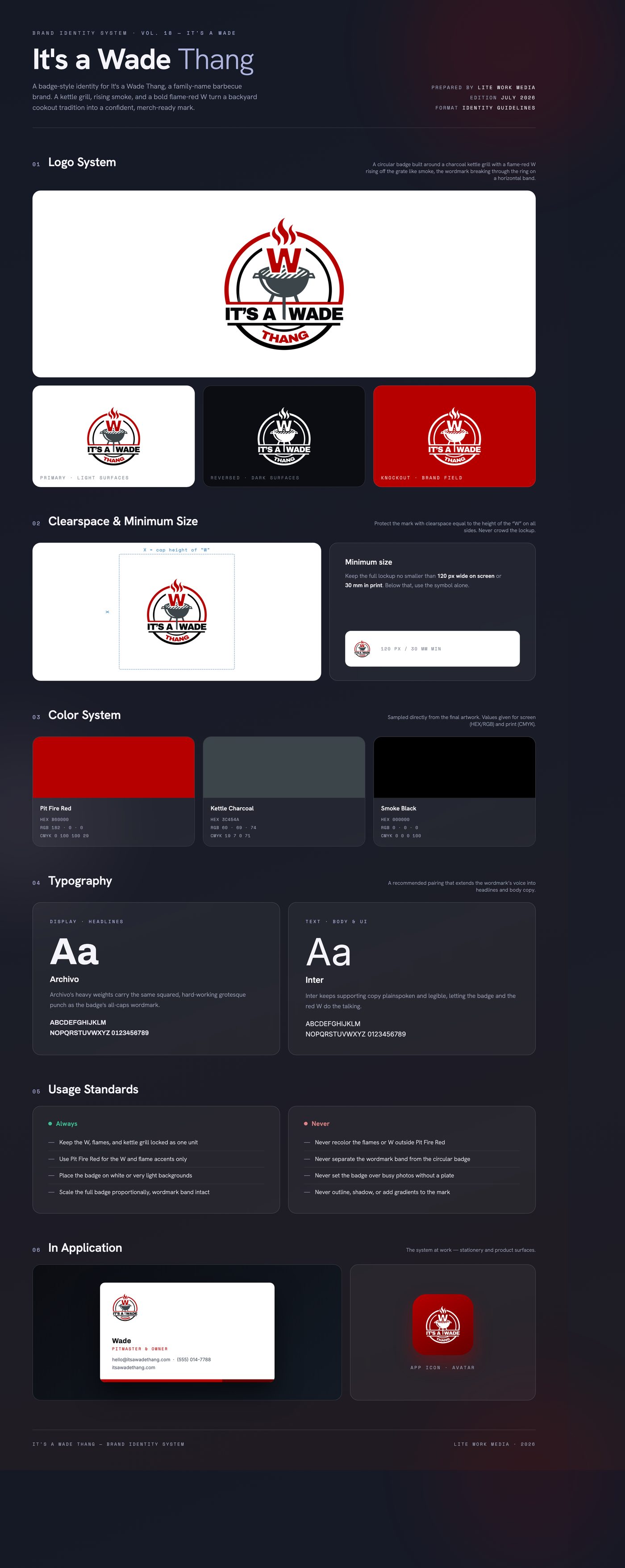
Delivered a badge lockup in two ring treatments — a full-color version with red outer ring and red THANG, and a quieter gray-ring variant — with the W-and-grill emblem, tight three-color palette, and type direction documented for apparel, decals, and social use.
Like what you see?
Start a project