BioSync Solutions — Brand Identity
Role — Logo design · identity system · brand guidelines · 3D motion
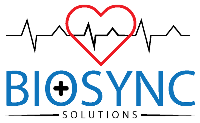
A healthcare technology company needed a mark that read as clinical and trustworthy without feeling cold. The identity had to work across product UI, stationery, and print at small sizes, and carry an unmistakable healthcare signal while staying modern enough for a software brand.
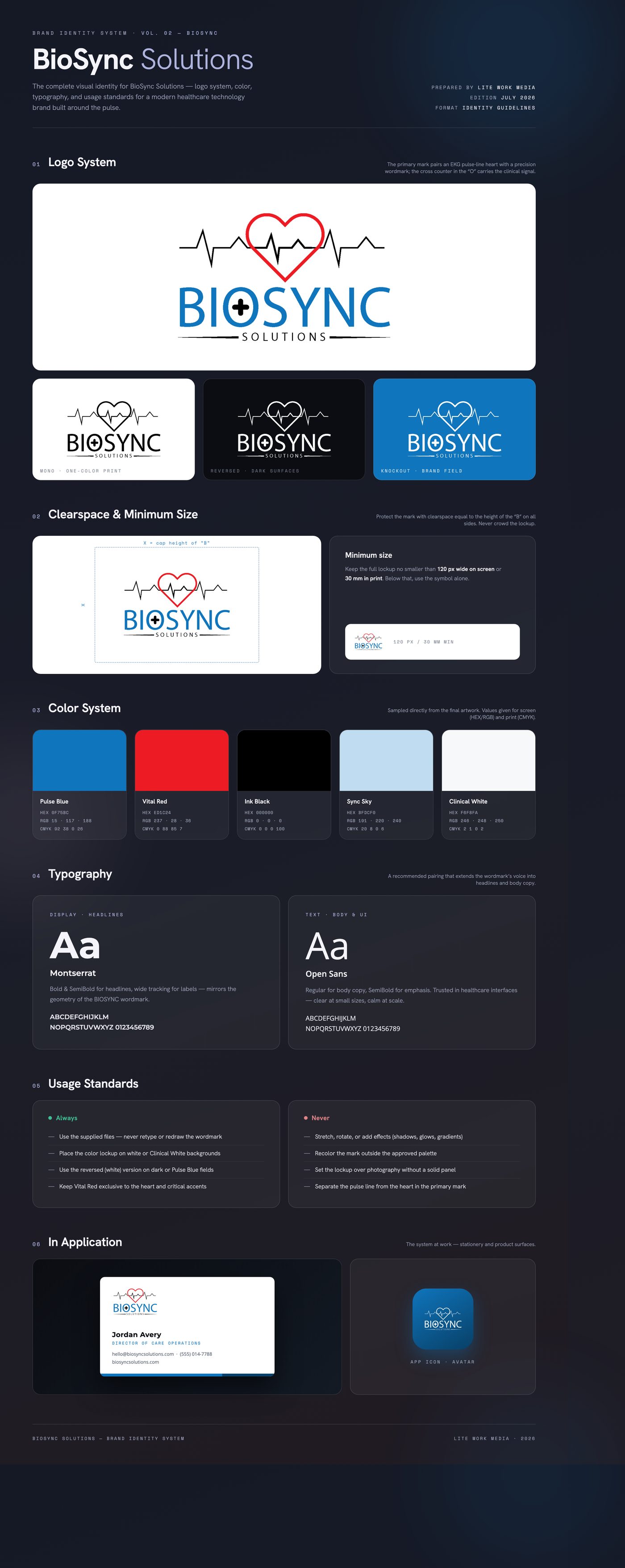
An EKG pulse line runs through a heart outline — the moment of sync between care and data. The wordmark sets BIOSYNC in a confident geometric sans with a medical cross in the counter of the O. Pulse Blue leads the palette for trust; Vital Red is reserved for the heart, keeping the emotional accent scarce and deliberate.
Delivered a full lockup suite — color, one-color black, and reversed white — with brand guidelines covering clearspace, minimum size, color values, and typography, plus stationery and packaging branding, an animated 3D logo intro with a cinematic audio sting, and apparel mockups.
Like what you see?
Start a project