No Stone Left Unturned — Brand Identity
Role — Logo design · identity system · brand guidelines

A recovery-focused church needed a mark that felt like hope rather than institution — something that could sit on a sanctuary banner, a sobriety chip, or a t-shirt and speak to people rebuilding their lives. The name itself carries the brief: a promise to search every corner for every person. The emblem had to tell that story literally, stay legible at patch and sticker sizes, and read as both a church and a recovery community without leaning on clichés.
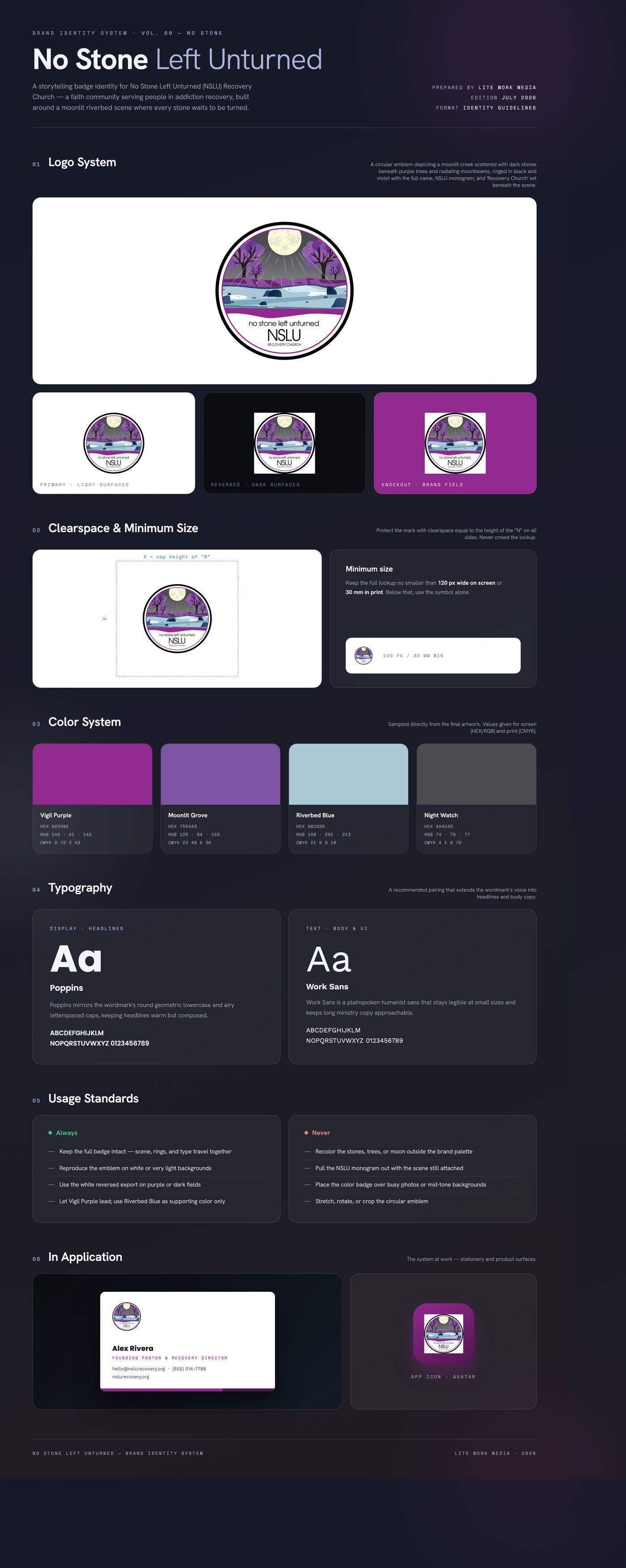
The mark is a full storytelling badge: a night riverbed strewn with dark stones, lit by a full moon whose rays reach every corner of the scene — no stone left in darkness. Purple, long tied to both faith and recovery awareness, drives the palette against icy river blues and a soft cream moon. Concentric black and violet rings frame the scene like a seal, with a geometric lowercase wordmark, thin-stroke NSLU monogram, and Recovery Church descriptor anchoring the base.
Delivered a finished circular emblem lockup in full color plus a reversed white export for dark and purple applications, exported as high-resolution transparent PNGs sized for print badges, apparel, signage, and digital use, with the extracted purple-and-river palette documented for supporting materials.
Like what you see?
Start a project