Studio XV Interiors — Brand Identity
Role — Logo design · identity system · brand guidelines

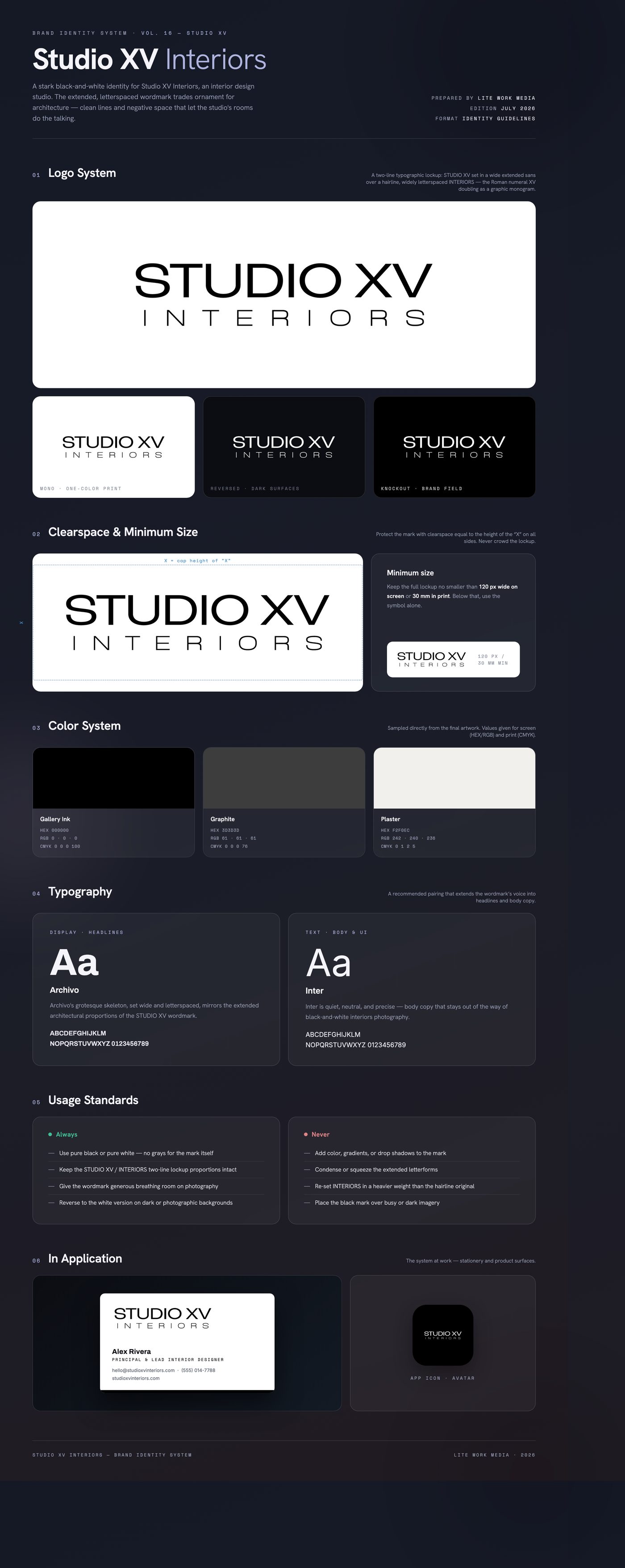
An interior design studio needs an identity that signals taste without competing with the work — the portfolio imagery has to stay the hero. The mark had to feel high-end and editorial, read cleanly across a website, signage, and print collateral, and stay timeless rather than trend-driven. Judging from the deliberately monochrome finals, the constraint was restraint: a pure black-and-white system with no color crutch, carried entirely by typography.
The solution is purely typographic. STUDIO XV is set in a wide, extended sans whose horizontal proportions echo architectural elevations and floor plans, while INTERIORS sits below as a hairline, widely tracked counterweight — a contrast of mass and air, like furniture in a well-composed room. The Roman numeral XV gives the name a built-in monogram. Black and white keeps the identity gallery-neutral, framing the studio's interiors photography instead of fighting it.
Delivered a finals suite of the two-line lockup in black and white — transparent PNGs for screen and layered use plus flat JPG versions — covering positive and reversed applications across web, print, and signage.
Like what you see?
Start a project