SoJanae Locs — Brand Identity
Role — Logo design · identity system · brand guidelines
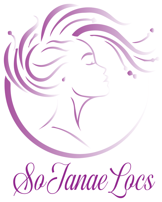
A loctician studio needed a mark that read as beauty and artistry, not just a salon service. Loc care is intimate, personal work, and the identity had to speak to clients who see their hair as part of who they are. Inferred from the artwork, the brief called for something feminine and aspirational that would hold up as a single-color mark on signage, apparel, and social avatars while carrying an elegant, upscale tone.
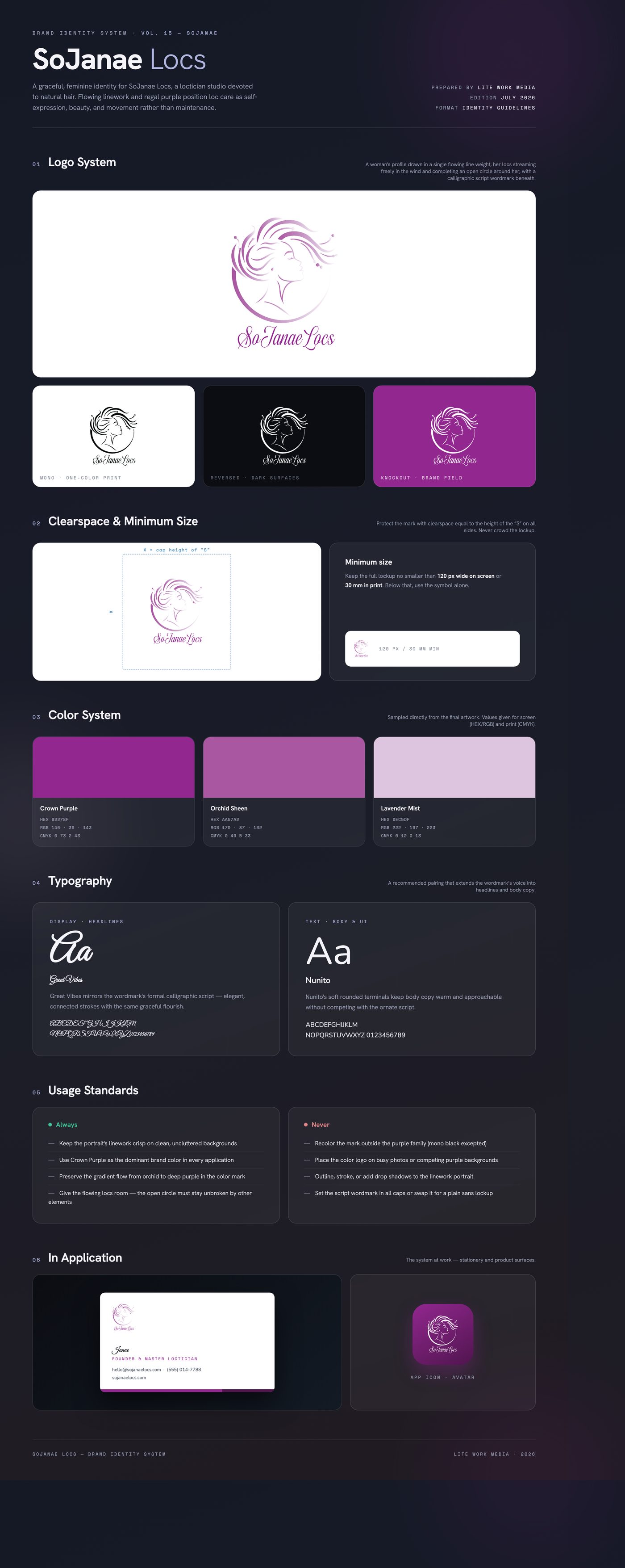
The solution is a portrait built from pure flowing line: a woman's face lifted in profile, her locs streaming in the wind and sweeping into an open circle that frames her. Every stroke shares the same calligraphic energy as the script wordmark below, so mark and name feel drawn by one hand. A regal purple gradient — deep Crown Purple into soft orchid — gives the identity richness and movement.
Delivered a full lockup suite: gradient color mark, one-color black version, and transparent PNG exports for print and screen, plus brand guidelines covering palette, type, and usage. A 3D motion version of the logo was also built in Blender for animated intros and social content.
Like what you see?
Start a project