Unified Paradigms — Brand Identity
Role — Logo design · identity system · brand guidelines
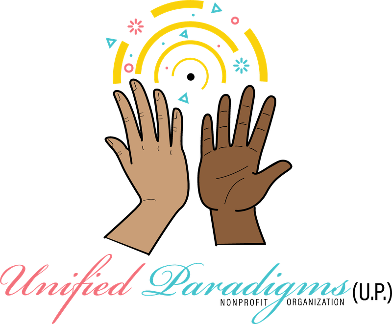
A new nonprofit organization needed a mark that communicated its core idea — unity across difference — instantly and warmly, without leaning on generic nonprofit clichés like globes or abstract ribbons. Inferring from the artwork, the identity had to feel celebratory and human rather than institutional, read clearly at small sizes despite an illustrative style, and carry the full name, the (U.P.) shorthand, and the 'nonprofit organization' descriptor in one lockup.
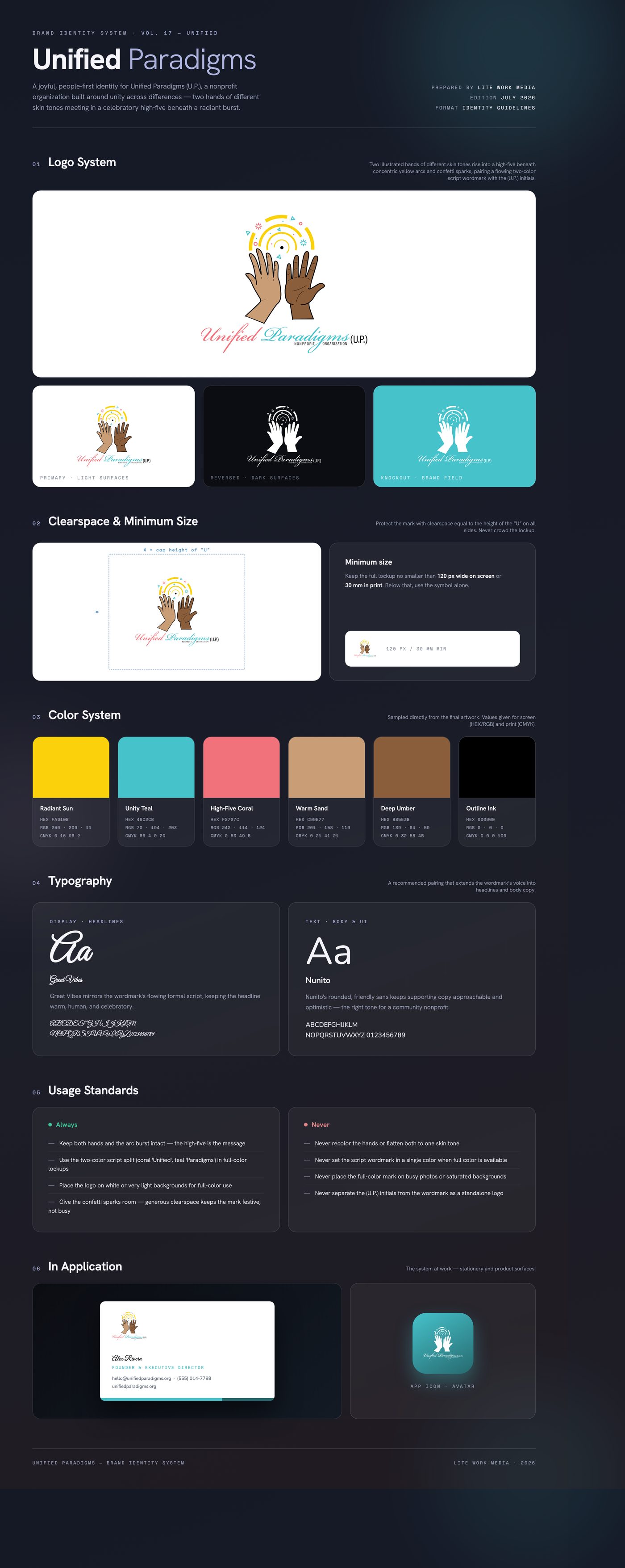
The solution is a moment of connection: two illustrated hands of visibly different skin tones rising into a high-five beneath concentric golden arcs and scattered confetti — unity rendered as celebration. Bold black keylines keep the illustration crisp, while a sunny yellow, teal, and coral palette radiates optimism. A flowing script wordmark splits the name across coral and teal, echoing the two hands, with the (U.P.) initials and a spaced-caps 'Nonprofit Organization' descriptor grounding the lockup.
Delivered a primary full-color lockup with the illustrated high-five mark, two-color script wordmark, (U.P.) shorthand, and nonprofit descriptor, supplied as native Adobe Illustrator artwork plus PDF, PNG, and JPG exports for print and digital use.
Like what you see?
Start a project