Sanmarlia Security
A guardian-crest identity for Sanmarlia Security, a private protection company. Two hands rise into a shield around a family of figures — security framed as care for people, not just property.
Logo System
Two upswept hands form the body of a shield and cradle a gold family of figures beneath a steel rim — protection depicted as hands-on guardianship.
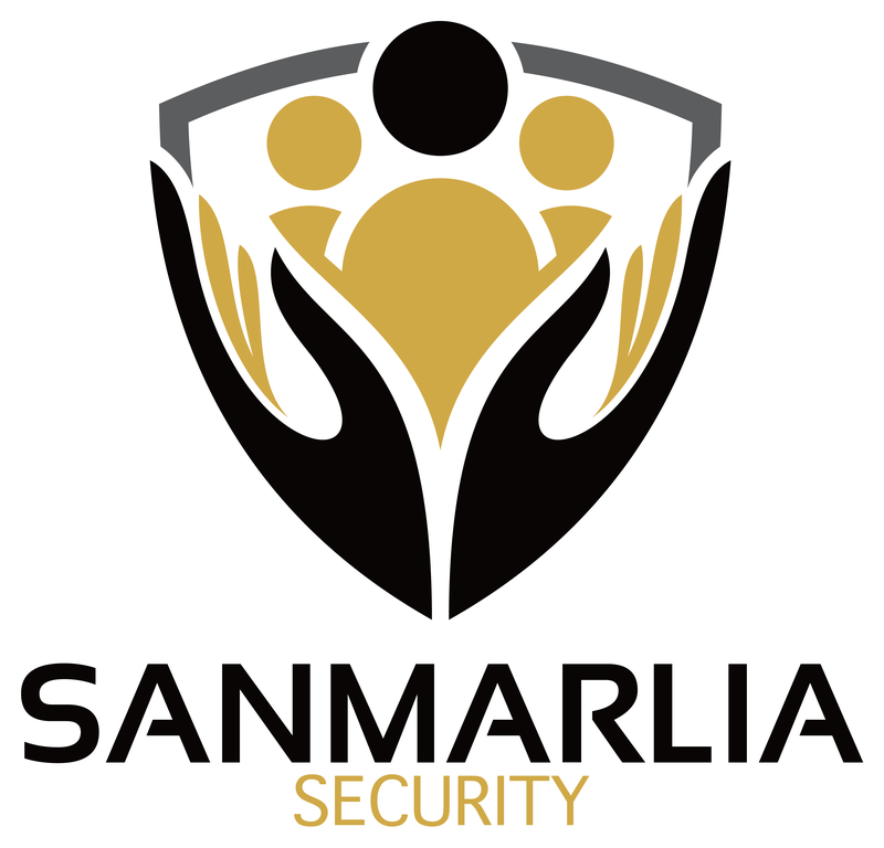 PRIMARY · LIGHT SURFACES
 REVERSED · DARK SURFACESKNOCKOUT · BRAND FIELD
Clearspace & Minimum Size
Clearspace equals the height of the “S” on all sides. Minimum size: 120 px on screen · 30 mm in print.
120 PX / 30 MM MIN
Color System
Values for screen (HEX / RGB) and print (CMYK).
RGB 208 · 169 · 71
CMYK 0 19 66 18
RGB 8 · 5 · 4
CMYK 0 37 50 97
RGB 92 · 93 · 95
CMYK 3 2 0 63
Typography
The pairing that extends the wordmark’s voice into headlines and body copy.
Montserrat's wide, geometric uppercase mirrors the wordmark's confident squared letterforms and holds authority at badge sizes.
Source Sans 3 is a plain-spoken, highly legible workhorse that keeps proposals and signage feeling professional and trustworthy.
Usage Standards
Always
- Set the mark on white or near-black so the hands-and-shield silhouette stays crisp
- Keep Guardian Gold reserved for the family figures and the SECURITY subline
- Use the full shield-plus-wordmark lockup on official documents and uniforms
- Maintain the vertical stack: shield centered above SANMARLIA, SECURITY tracked wide beneath
Never
- Never recolor the hands — they stay black (or reverse to white as a knockout)
- Never separate the family figures from the shield and hands
- Never place the mark over busy photography that swallows the negative-space shield rim
- Never swap the gold for a brighter yellow; it reads as caution signage, not protection