Sanmarlia Security — Brand Identity
Role — Logo design · identity system · brand guidelines
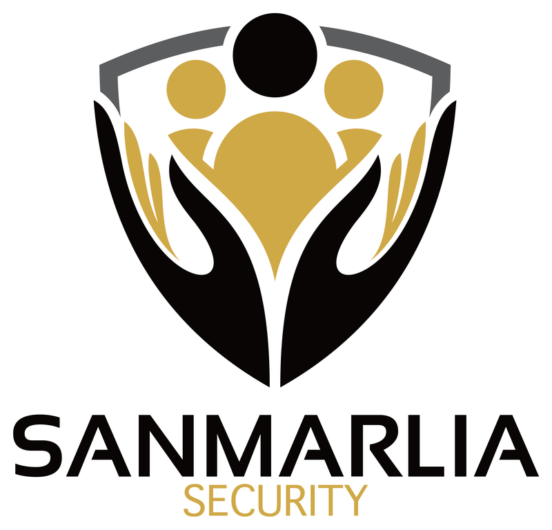
Security brands tend to signal force — eagles, stars, hard chevrons — which can feel cold to the families and businesses actually hiring the service. Judging from the artwork, Sanmarlia needed a crest that carried the authority of a traditional security shield while communicating something warmer: that the people inside the shield are the point. The mark also had to hold up as a badge — on uniforms, vehicles, and documents — in strict black, gold, and gray.
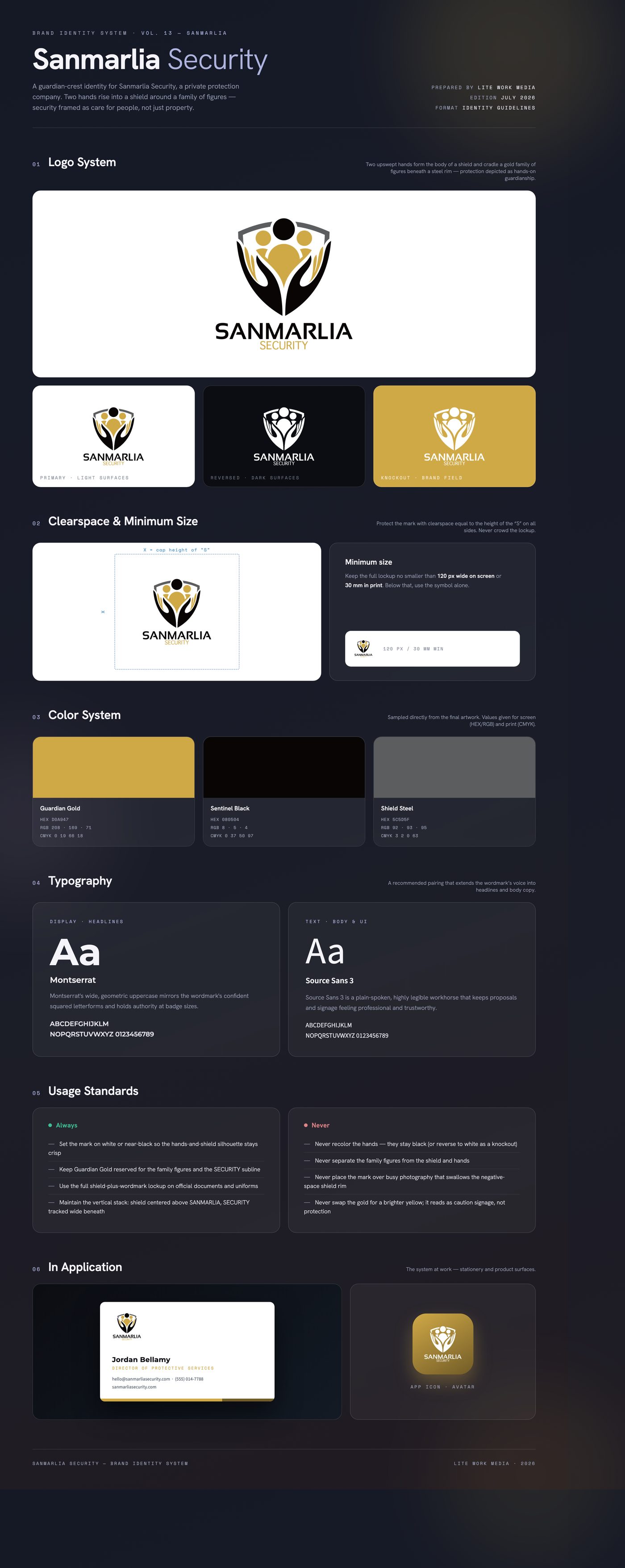
The solution builds the shield out of the protectors themselves: two black hands sweep upward to form the crest's body, enclosing a gold family of figures under a steel-gray rim, with a black guardian figure at the apex. Negative space does the heavy lifting, keeping the badge legible at patch size. A wide, squared uppercase wordmark anchors the stack, with SECURITY tracked out in gold to tie the type back to the figures it protects.
Delivered a full lockup suite: primary color crest on white, a transparent-background export for placement on any surface, and a 3D beveled render of the badge in polished black and gold for presentation and signage mockups. Supplied as high-resolution PNGs with the stacked shield-and-wordmark system ready for uniforms, vehicles, and print.
Like what you see?
Start a project