Rise n’ Grind — Brand Identity
Role — Logo design · identity system · brand guidelines
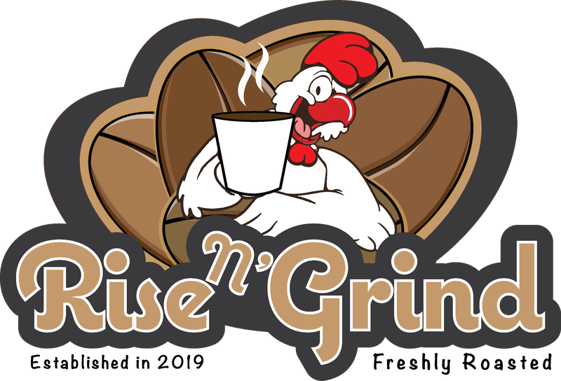
A small-batch coffee roaster established in 2019 needed a mark that could sell the morning ritual with personality rather than the moody minimalism common in specialty coffee. The name puns on the rooster's wake-up call and the coffee grind, so the logo had to carry both ideas at once, stay legible as a printed label and merch graphic, and feel approachable to everyday drinkers — all inferences drawn from the artwork's mascot-and-tagline construction.
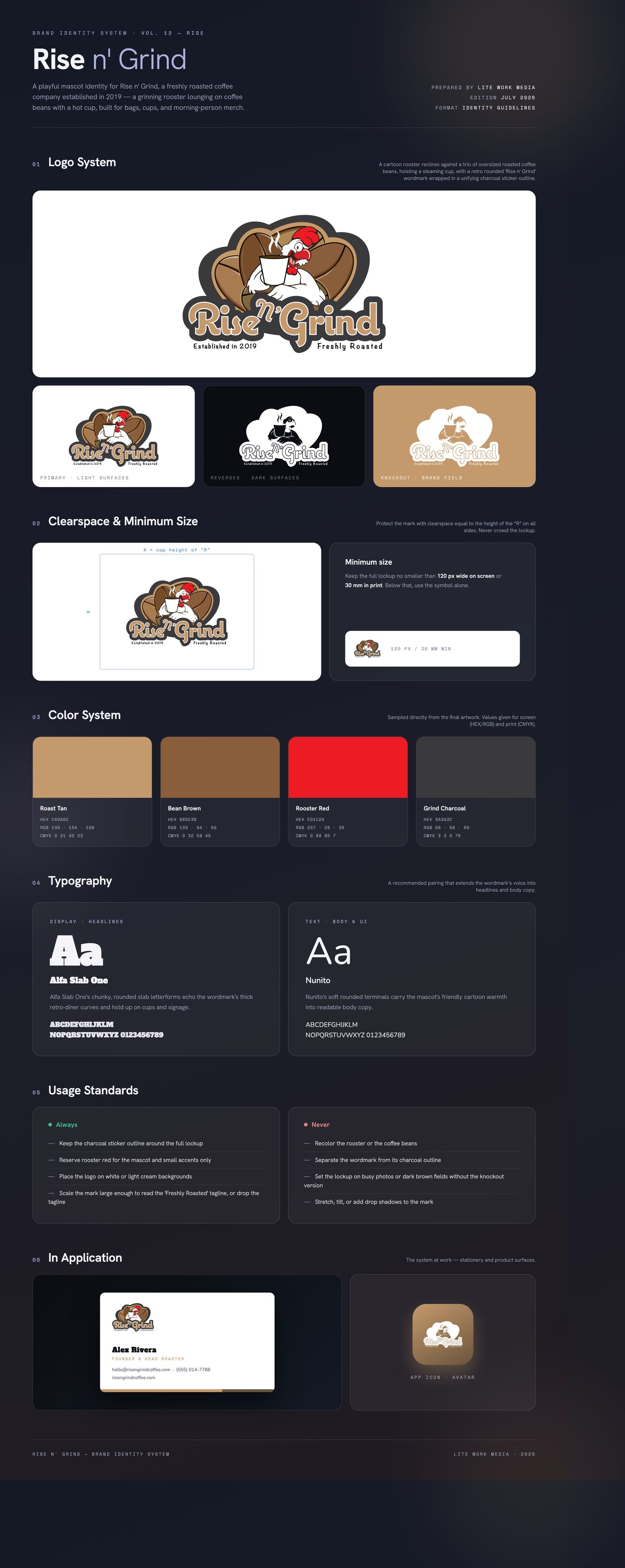
The identity leans fully into the pun: a wide-eyed cartoon rooster lounges against three oversized roasted coffee beans, raising a steaming cup like a morning toast. A warm roast palette — tan, bean brown, and charcoal — grounds the mark in coffee, while the rooster's bright red comb gives it a wake-up jolt. A retro rounded wordmark with a script 'n'' sits inside a continuous charcoal sticker outline that unifies mascot, beans, and type into one badge.
Delivered a full-color primary badge lockup with 'Established in 2019' and 'Freshly Roasted' taglines, an alternate 'Rise And Grind — Rooster LLC' wordmark variant, and vector source artwork (AI) with PNG exports sized for labels, cups, and social use.
Like what you see?
Start a project