KCC Magic Butter — Brand Identity
Role — Logo design · identity system · brand guidelines

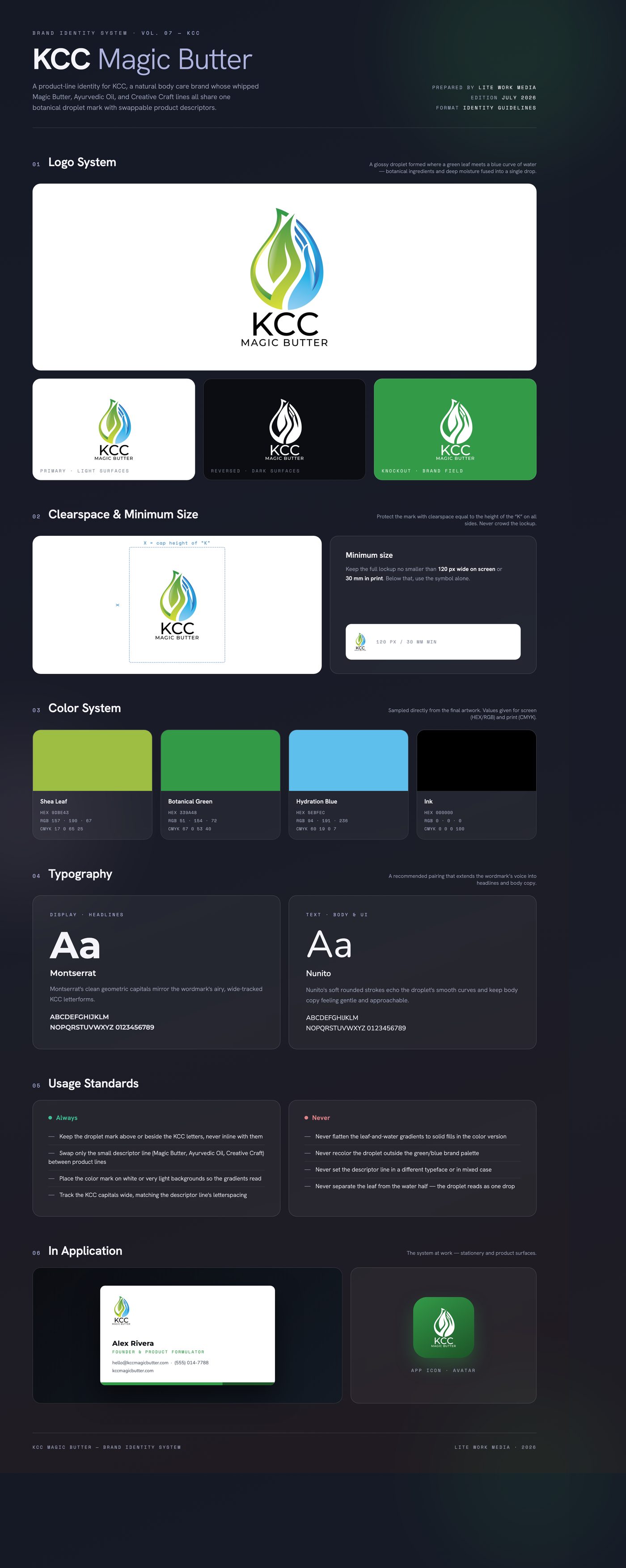
KCC needed one mark that could carry an expanding natural body care range — the flagship Magic Butter plus an Ayurvedic Oil and a Creative Craft line. The export set makes the constraint clear: the same symbol had to work as a family system, with only a small descriptor line changing per product. That meant a mark generic enough to span butters, oils, and crafts, yet specific enough to signal natural, moisture-rich care at shelf-glance.
The solution is a single glossy droplet split down the middle: the left half a layered green leaf, the right half a blue sweep of water. Botanicals plus hydration, fused into the literal form of the product — a drop of oil or a scoop of butter. Yellow-green to deep-green and sky-to-royal blue gradients give the drop a dimensional, cosmetic-grade sheen, while the wide-tracked geometric KCC capitals below stay quiet and let the symbol carry the color.
Delivered a product-line lockup suite — KCC symbol-only, KCC Magic Butter, KCC Ayurvedic Oil, and KCC Creative Craft — in high-resolution PNG on both white and transparent backgrounds, with the shared droplet mark and swappable descriptor system ready to extend to future product lines.
Like what you see?
Start a project